Advanced Responsive Image Stack

Screenshots

Examples

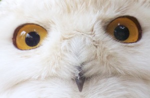
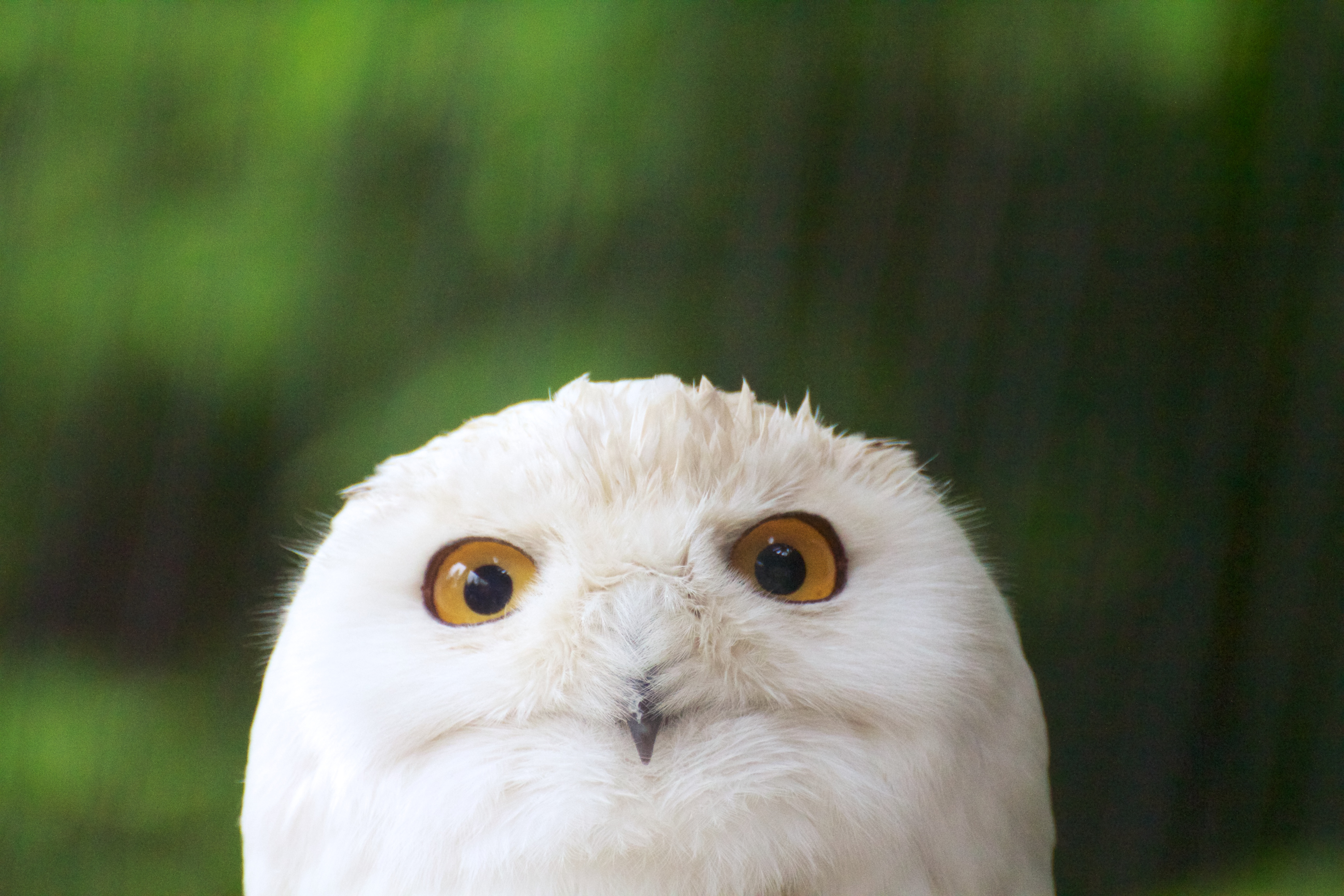
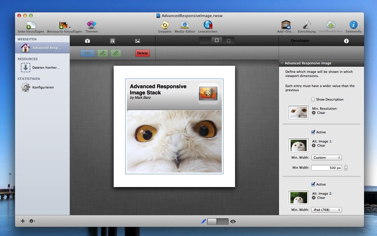
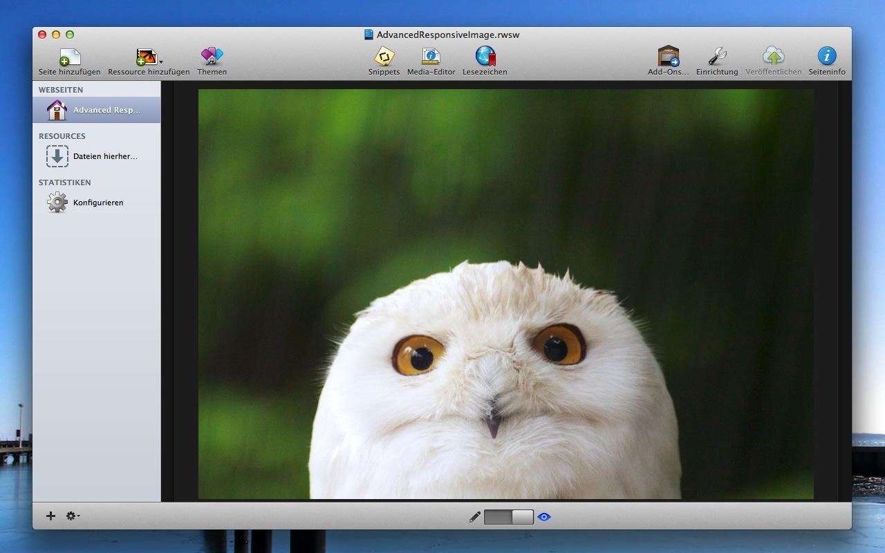
You will see different cropped version of the owl on different devices like iPhone, iPad and desktop browsers. You can even use your desktop browser and resize the application to see how it changes the images source. In this example the breakpoints will be at 500px, 768px and 1200px width.

Settings

  • Min. Resolution Image: This image will be shown if no other image breakpoint is activated.
  • Alternative Image 1-3: Each of the alternative images can be activated separately. Additionally you can set up a minimum width for the image to be used on a device. If you use a minimum width of 500px, that image will only be shown on devices with more than 500px of possible width. If you use another image breakpoint at 1000px the first image will be used on devices between 500px and 1000px width. The other one on devices with more than 1000px width.
    You can choose the minimum width preselected for iPhone, iPad or custom values up to 5000px

Infos and Requirements

Rapidweaver
Rapidweaver 5/6/7
Stacks 2 only
Stacks 2 / 3
Responsive
Compatible to
responsive themes
Internet
Internet connection
for preview

Browser Compatibility

  • Safari
  • Chrome
  • Opera
  • Internet Explorer
  • Firefox

Screencast