Barz Stacks
All you need for your everyday webdesign

Responsive Switcher Stack
This Stack switches content based on the width of your browser. Choose which content should be seen on smaller devices and which on larger ones like desktops.

Example
The following part will show a butterfly image if your browser width is greater than 768px. Below 768px it will switch to a simple text stack. Please try and resize your browser.
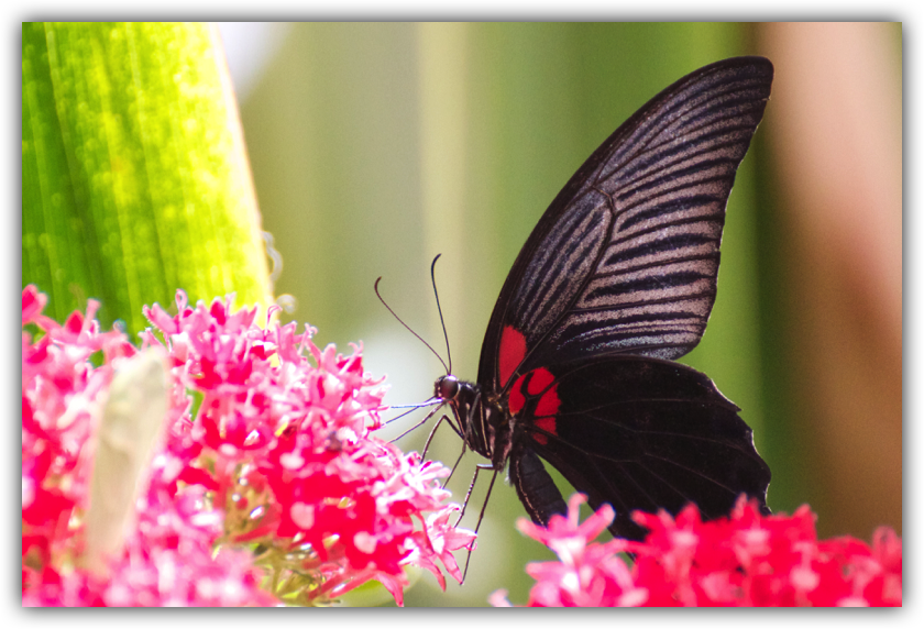
This is just info text. If you have a larger browser you could see here a great photo.
If you are on an iPhone please rotate your phone from landscape to portrait mode and vice versa.
If you are on an iPhone please rotate your phone from landscape to portrait mode and vice versa.
Infos and Requirements

Rapidweaver 5/6/7

Stacks 2 / 3

Compatible to
responsive themes
responsive themes